Animals on Psychedelics | AOP005


Vladimir Gnatenko - Die Nag EP
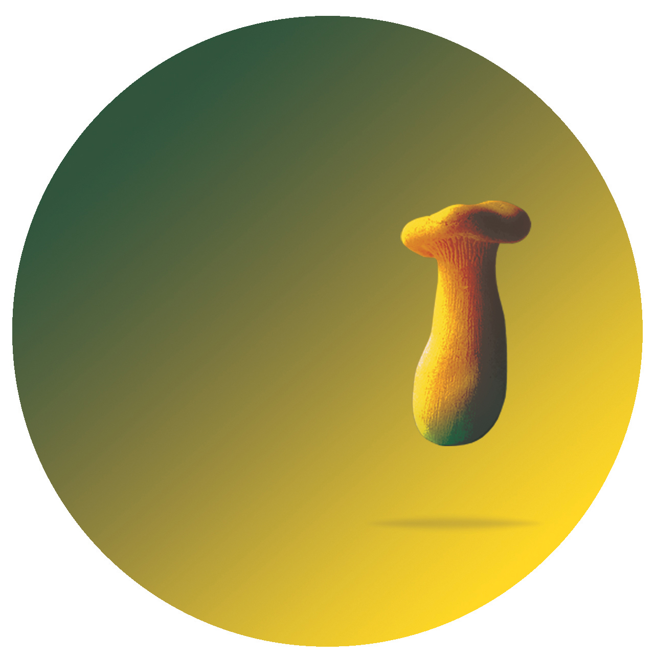
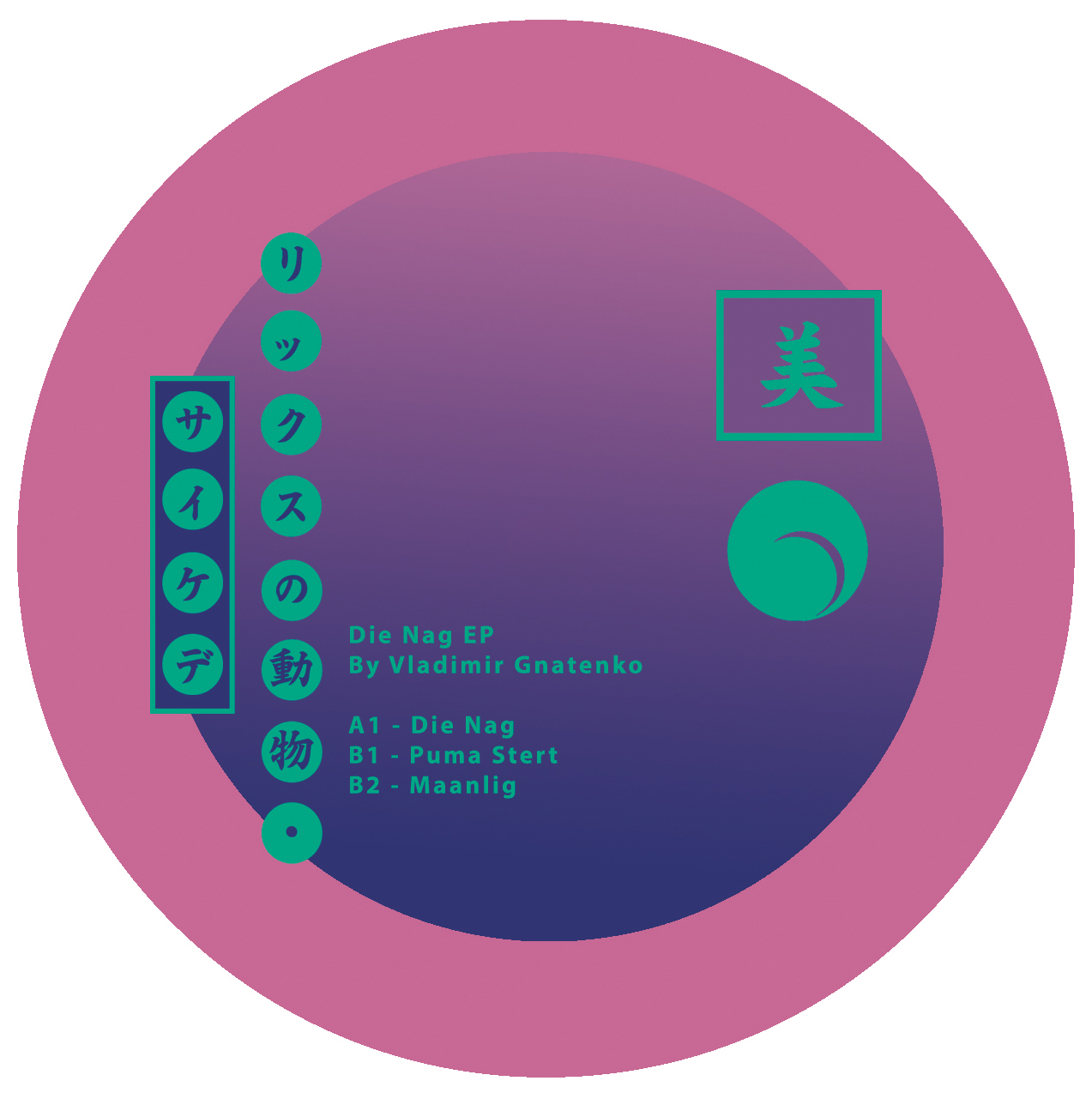
“A wolf, berries, a tail of a puma and the moonlight night sky”.
This was pretty much the brief for this release on
Animals on Psychedelics and we definitely had a lot of fun with it.
This was the second project from AOP where the brief was generated directly from the artists visual wantlist.
Continuing the language and symbols from the previous release with a nod to another abstract language on the back of the sleeve. Keeping that retro, japanese, neon feel running, making sure the eye is always moving over the design, trying to work the various elements out.
Animals on Psychdelics | 004
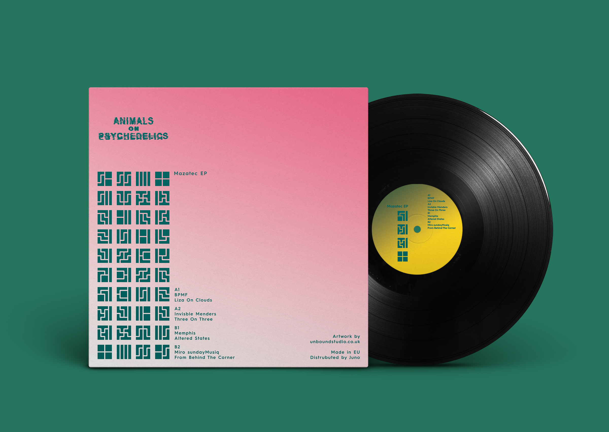
BPMF | Invisible Menders | Memphis | Miro Sundaymusiq - Mazatec EP
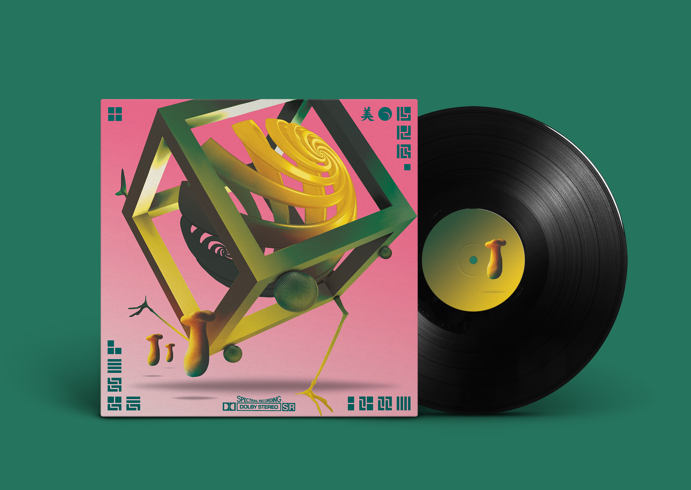
We went pretty deep with this one. Although probably the least ‘animal’ of all so far.
We worked from an initial idea which in it’s first form was more like an abstract surrealist painting than anything we had created for the Animals on Pyschadelics releases at that point. From that we developed this dreamlike, 3D creature with abstract features (legs, tail, eyes) running across the front cover. Although a little obvious, the mushrooms work really well, moving along closely as little helpers in the scene which adds to the surreal nature of the image.
On the rear we kept it simple, with only information and a new language symbol set and which is echoed on the front cover.
Animals on Psychedelics | 003
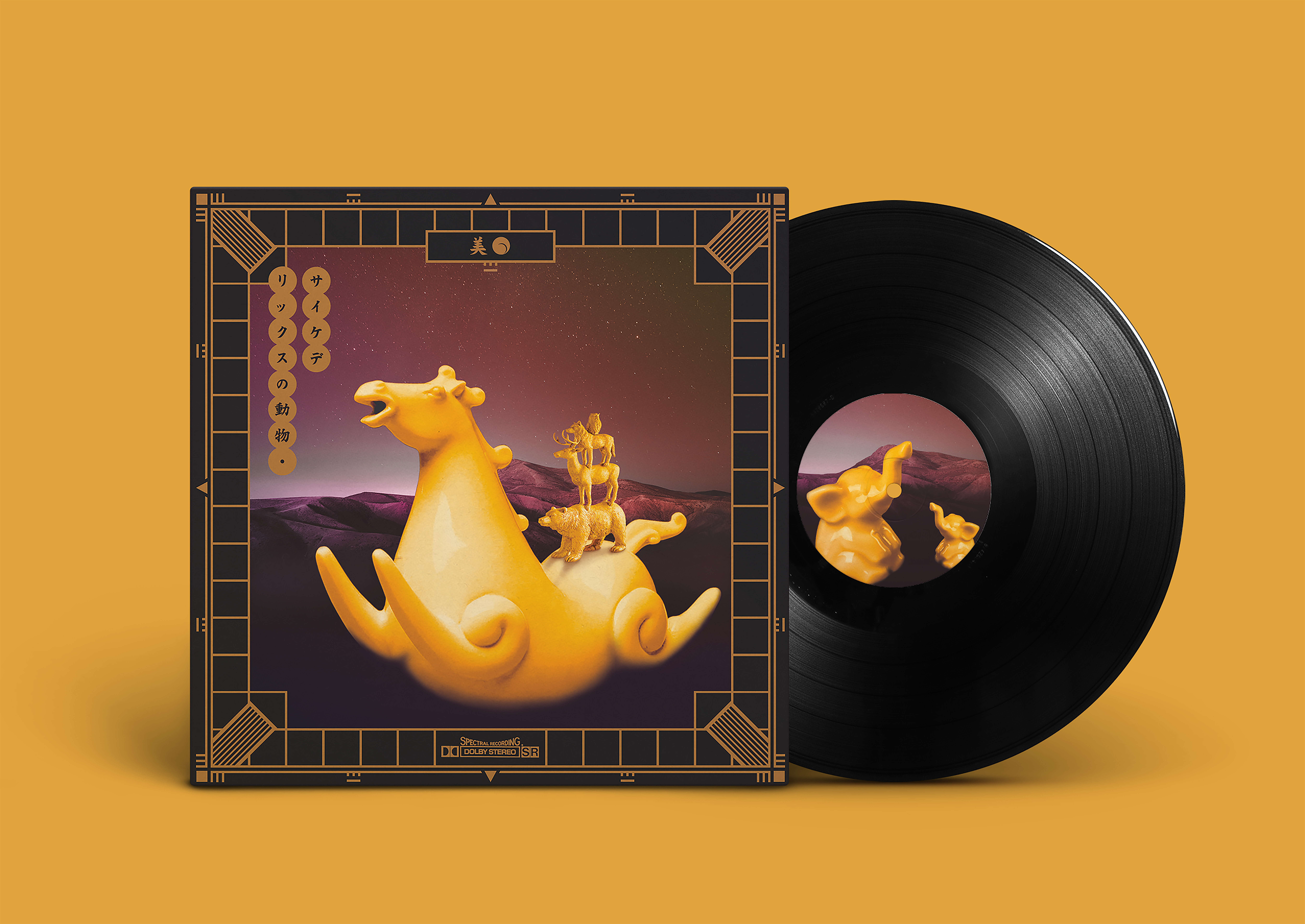

Memphis - Sunken Gardens
We had a lot of fun with this project and really happy with the end result. Mainly because we managed to include a reference to what is an iconic part of British TV history, the BBC test card. Every kid or adult from the 90’s should recognise this and was an important nod to the era when this music was originally made.
Being pulled from DAT’s made between 1992-94 we wanted to create an almost archival feel on the back which contained a great amount of information. This was continued around to the front where the imagery is inspired by the otherworldly music of Memphis.

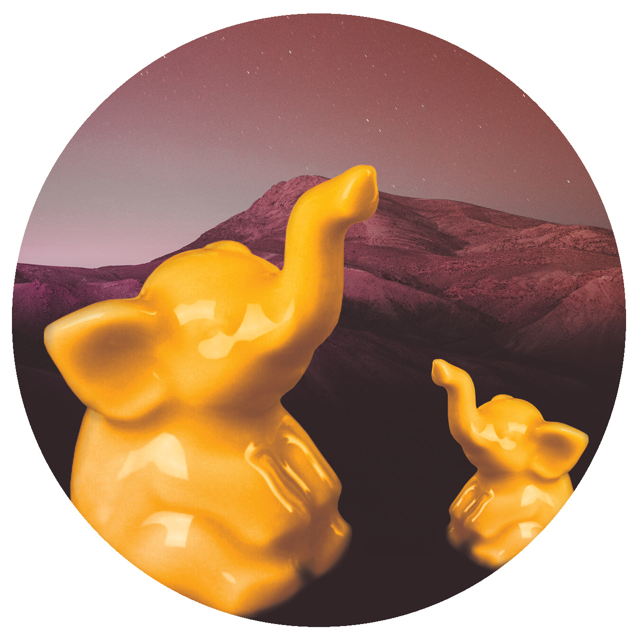
Animals on Psychedelics | 002
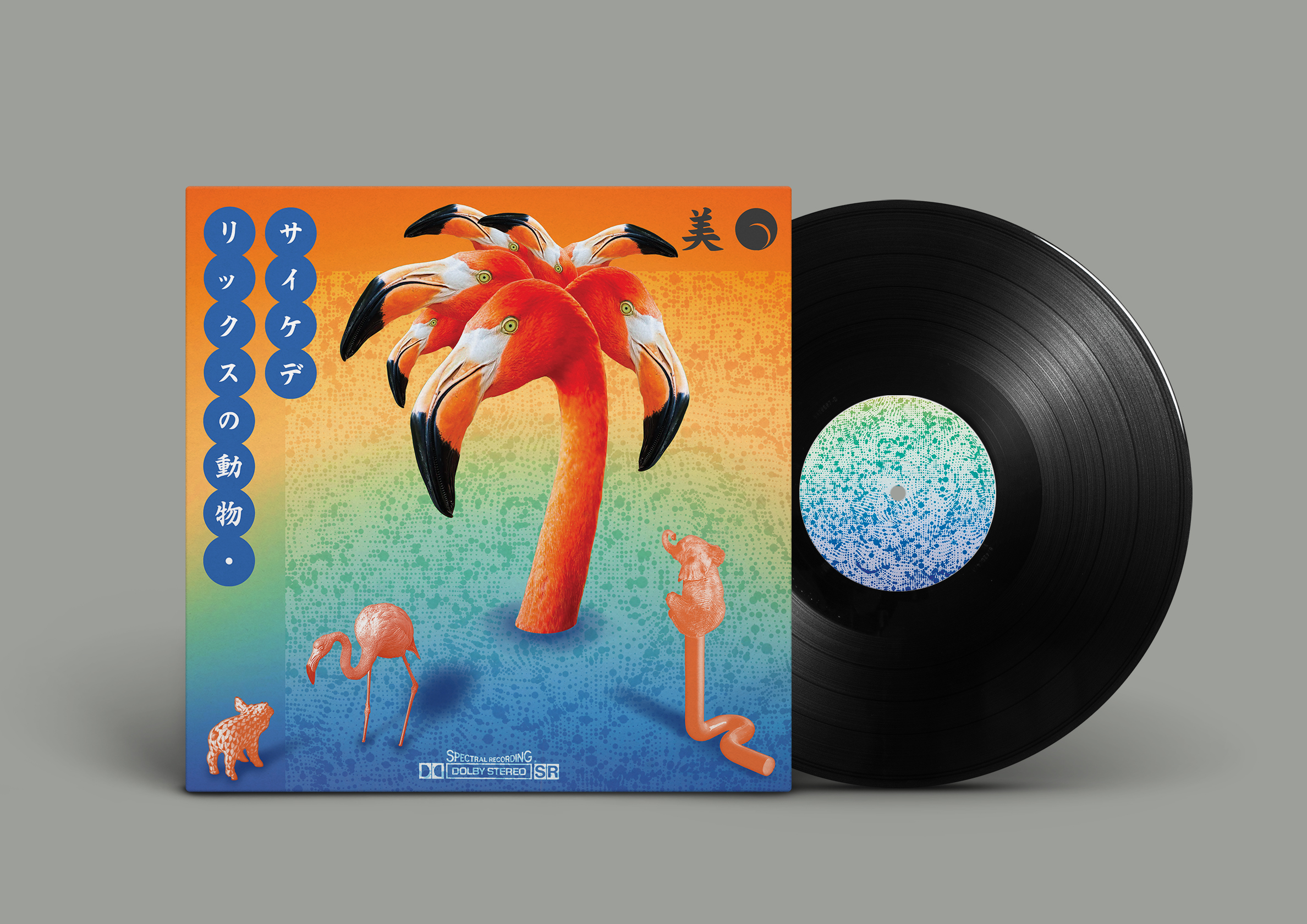
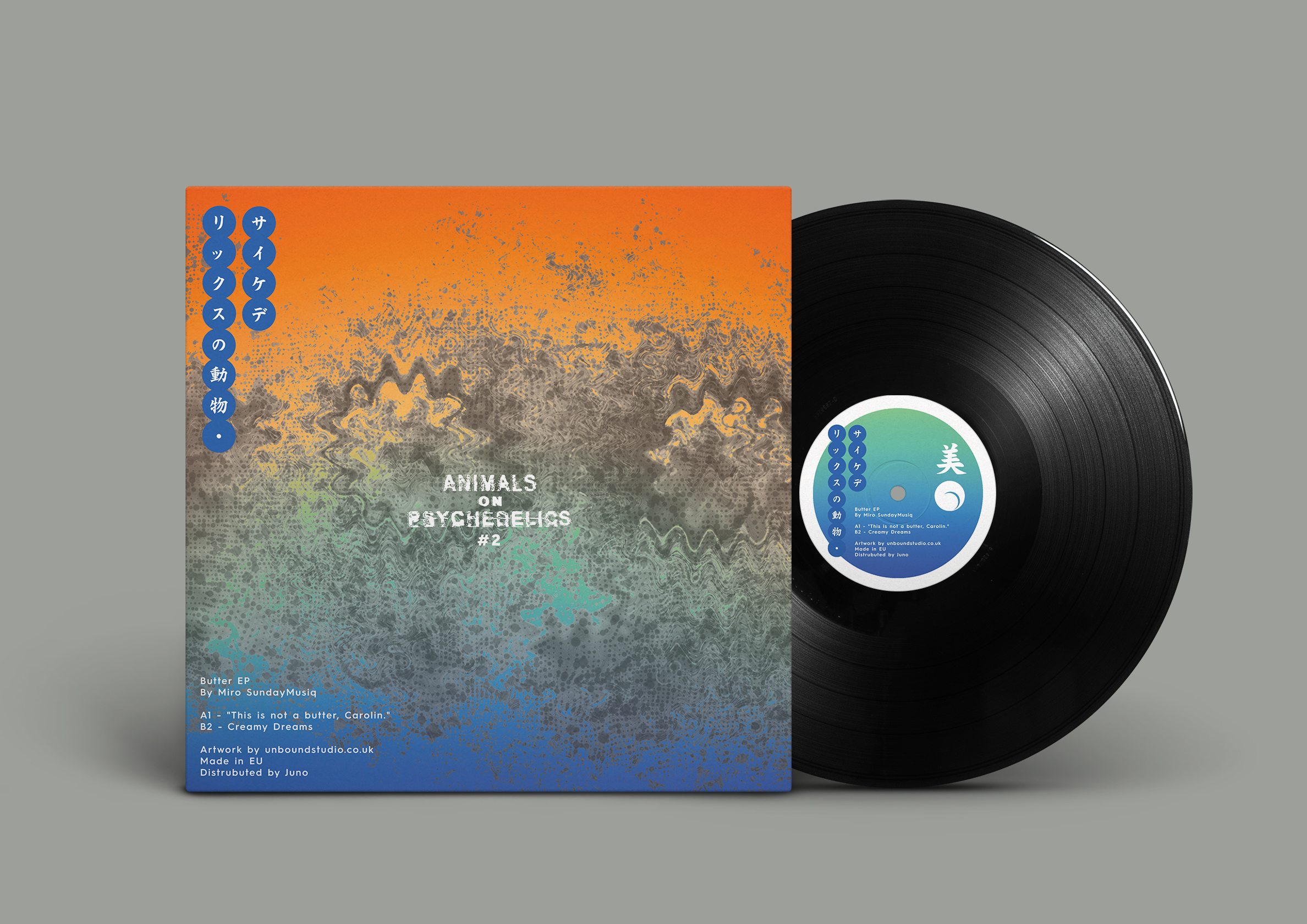
Miro Sundaymusiq - Butter EP
This was the first project for the Animals on Psychedelics label working with Carl Hardy. The brief was quite simple. Carl just wanted something trippy, psychedelic, and visually colourful that played on the labels name. We created much stronger imagery and a recognisable aesthetic in line with the label’s intentions.
As well as the imagery the typeface is derived from retro, Japanese artwork Carl was in love with at the time. We decided to work this into the labels new typography but still keeping the existing logo for reference (for anyone who didn’t know Japanese).
Arthouse | Manchester


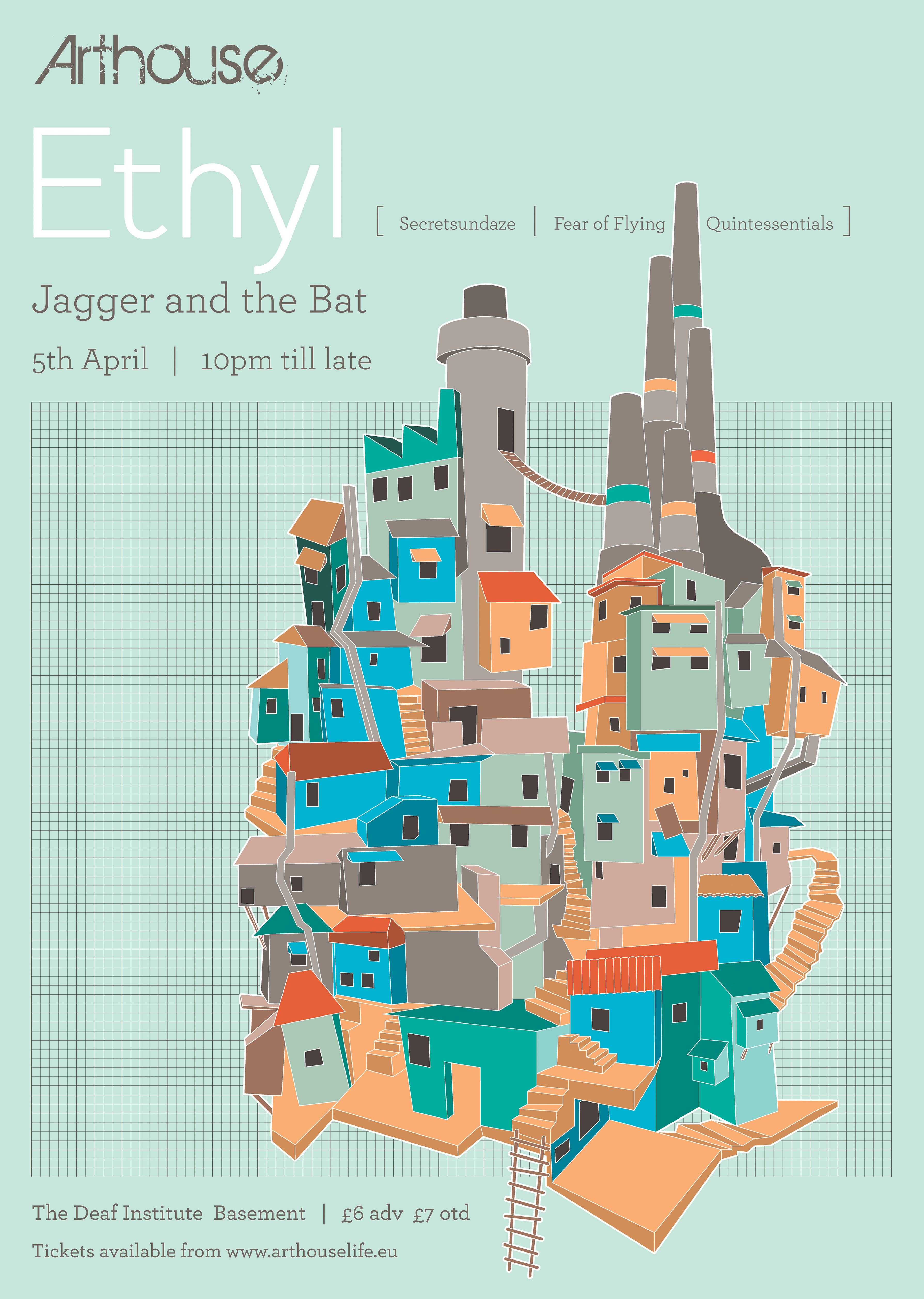
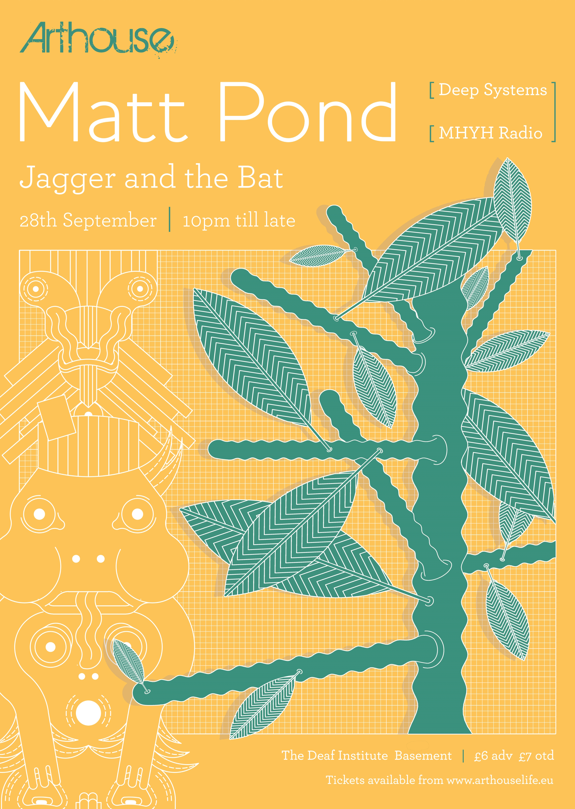


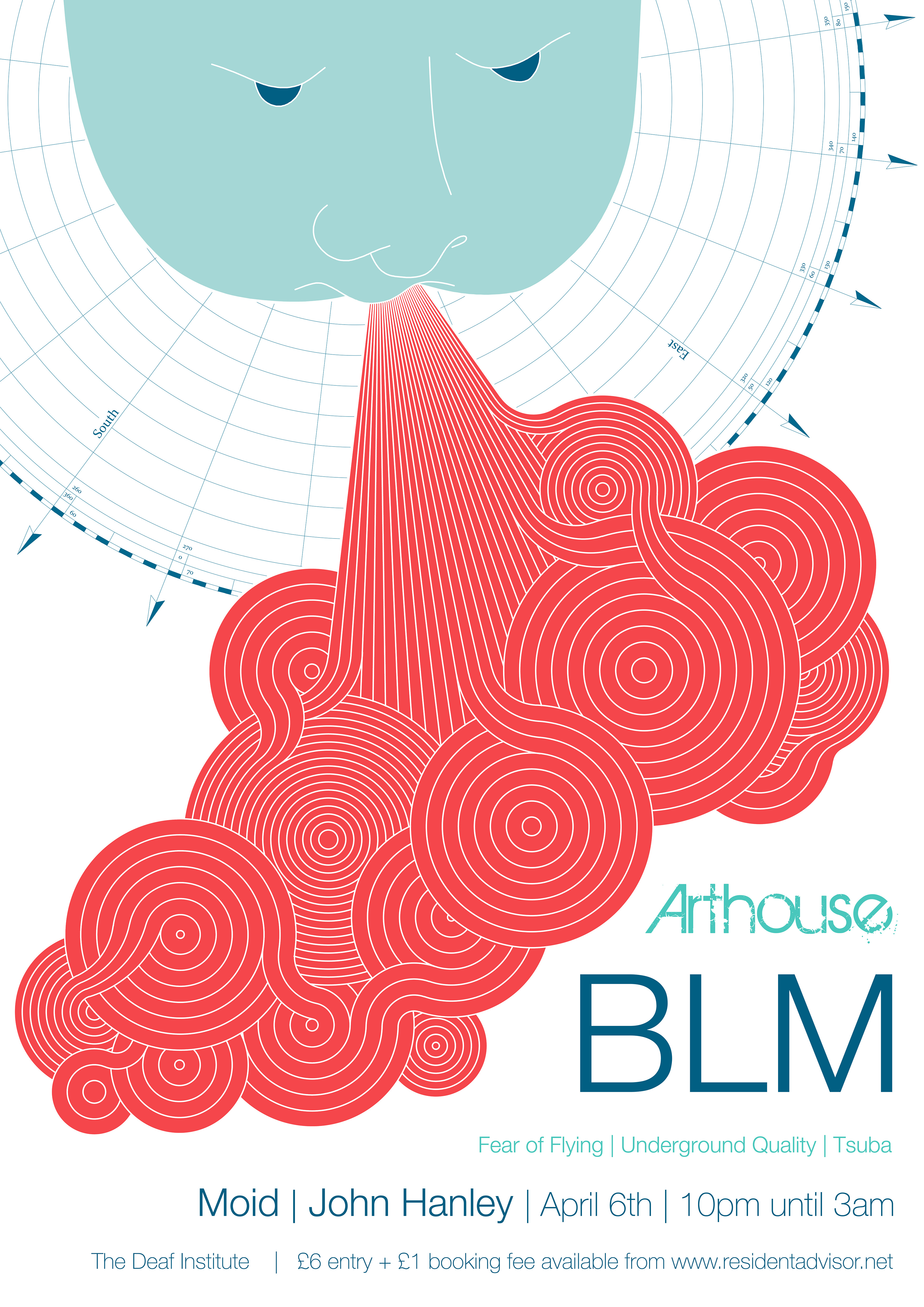


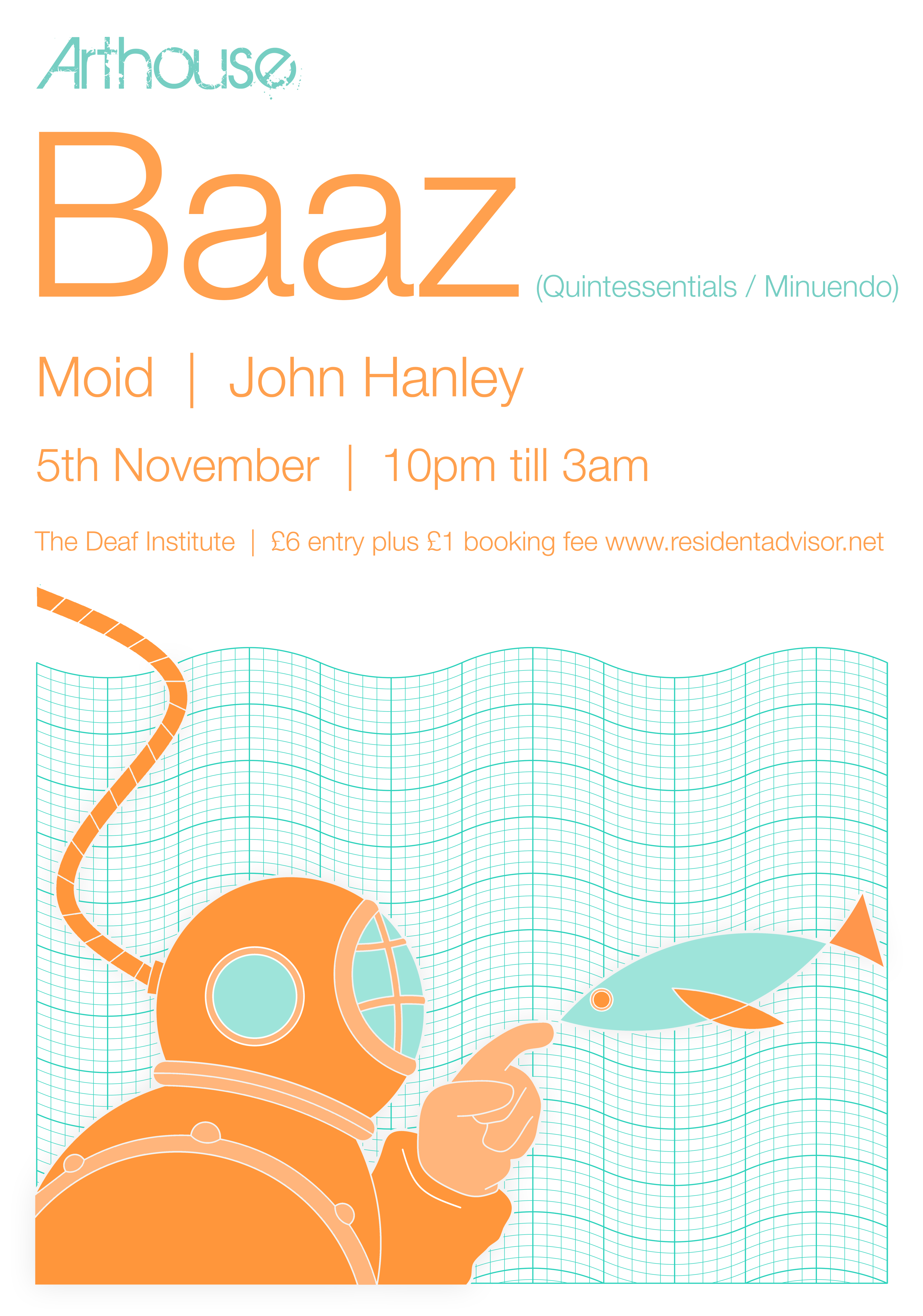
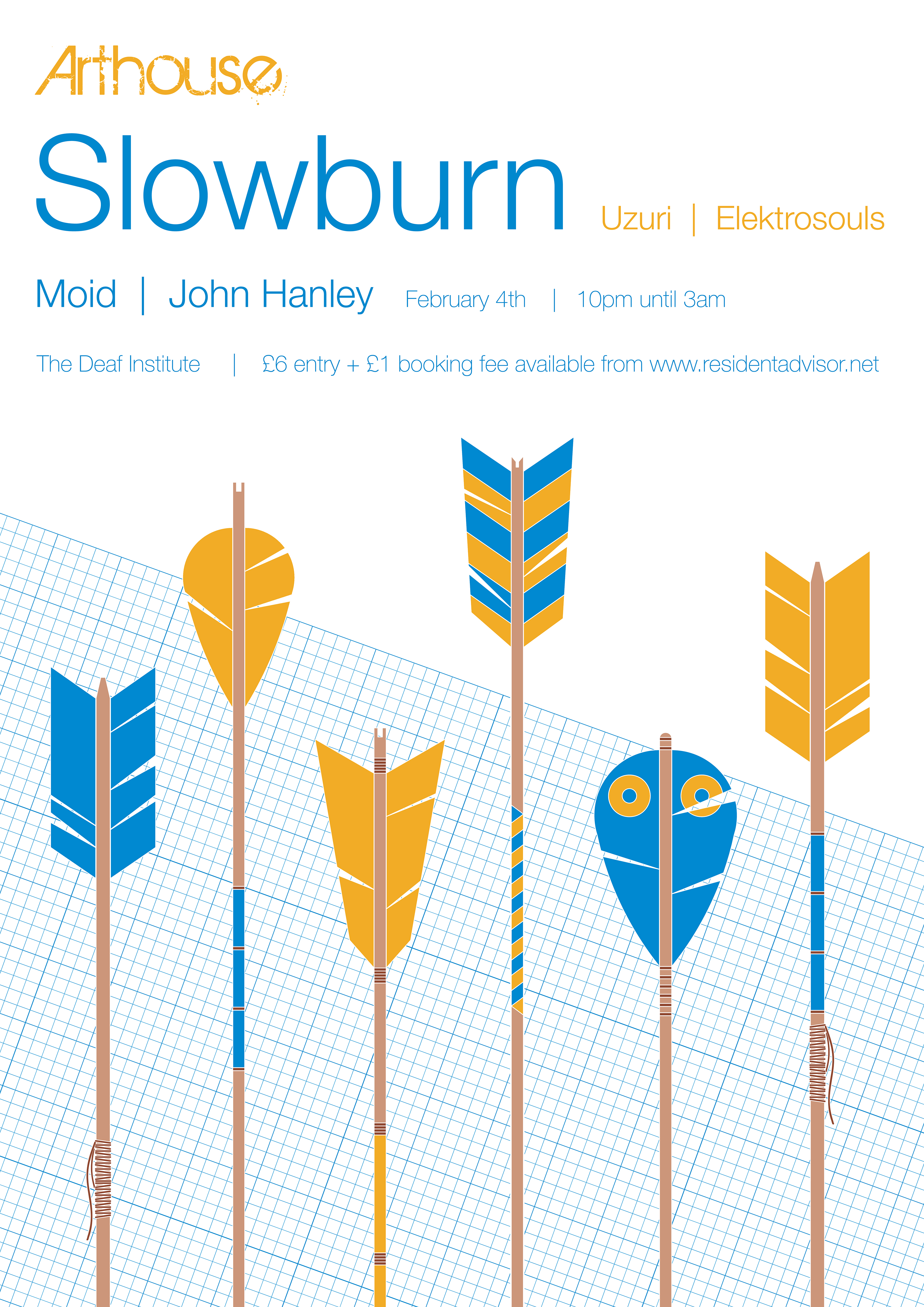

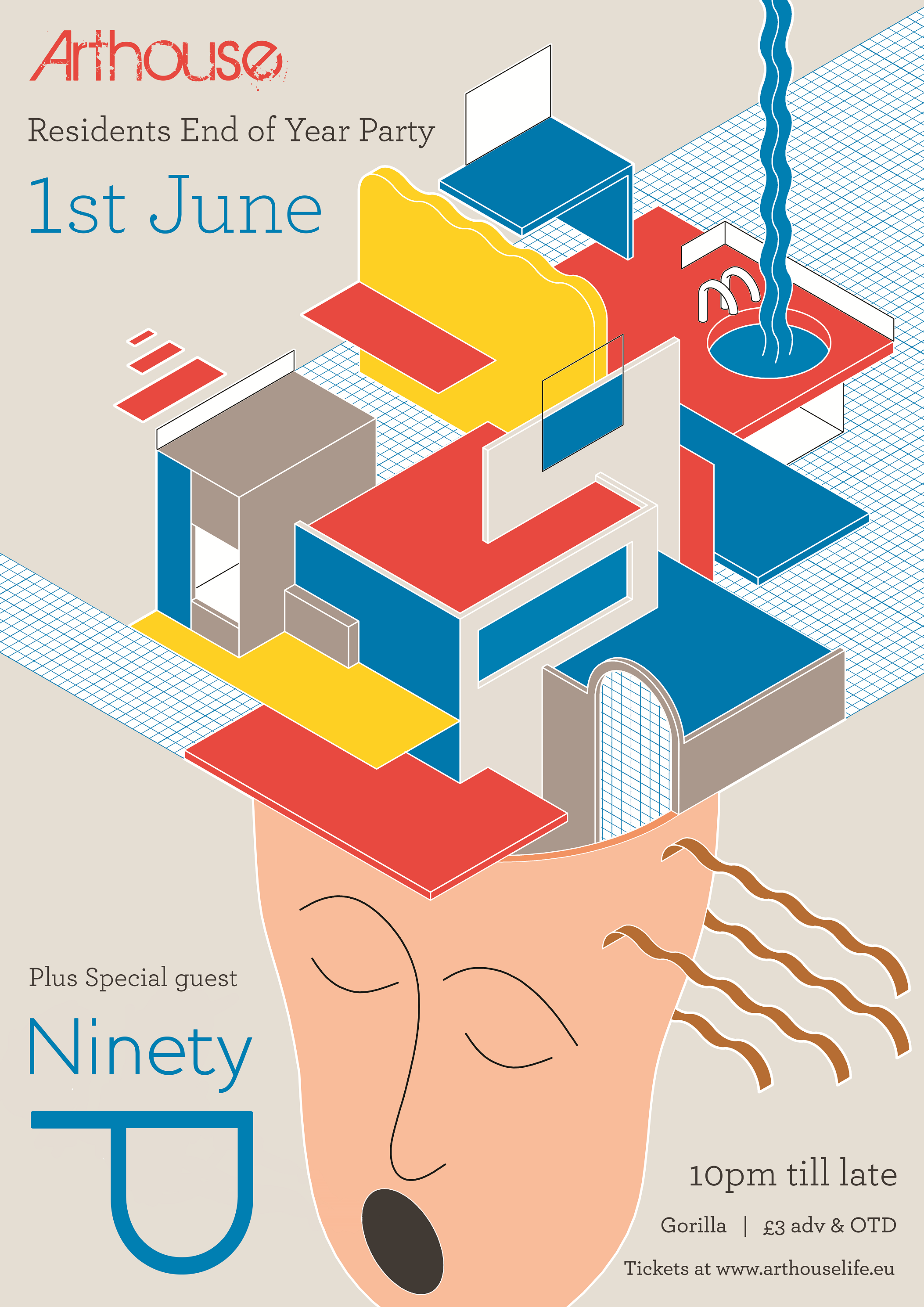
Arthouse
is a collective of hedonistic misfits. Good natured people wanting to promote
and support underground dance music in the name of extending the weekend as
long as it can possibly go.
We were tasked with creating a more refined aesthetic for this playful, friendly and welcoming monthly music event (focused mainly on house and techno) in
Manchester’s Deaf Institute.
Starting with a basic work set of a grid pattern and the go-to modern typeface Helvetica,
Arthouse would develop from a predominantly 2D aesthetic to more detailed,
intricate 3D illustrations that still maintained a strong visual impact. It was
really great fun playing around with colours on this body of work and
developing the Arthouse identity form whilst keeping the original idea for the
event intact.
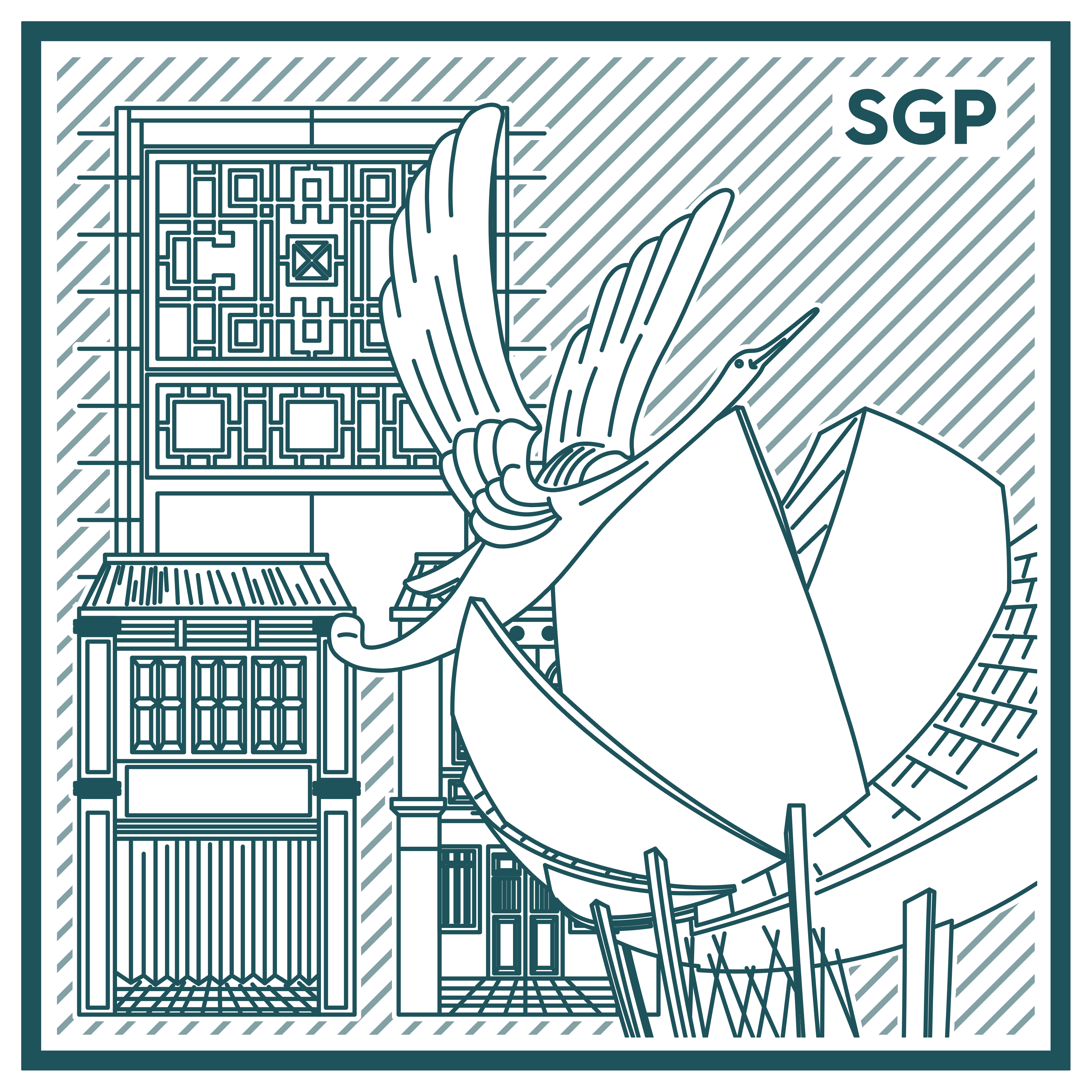
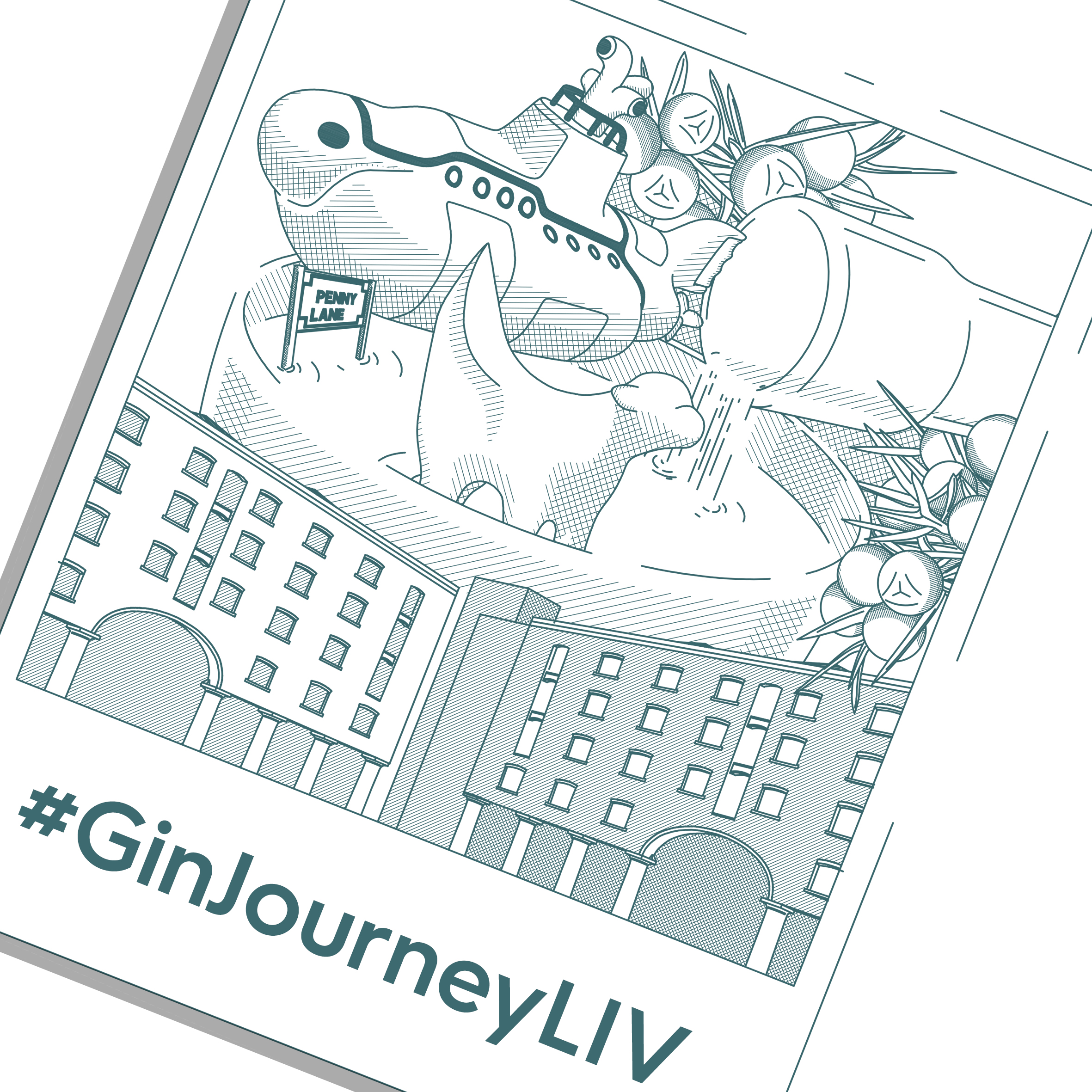
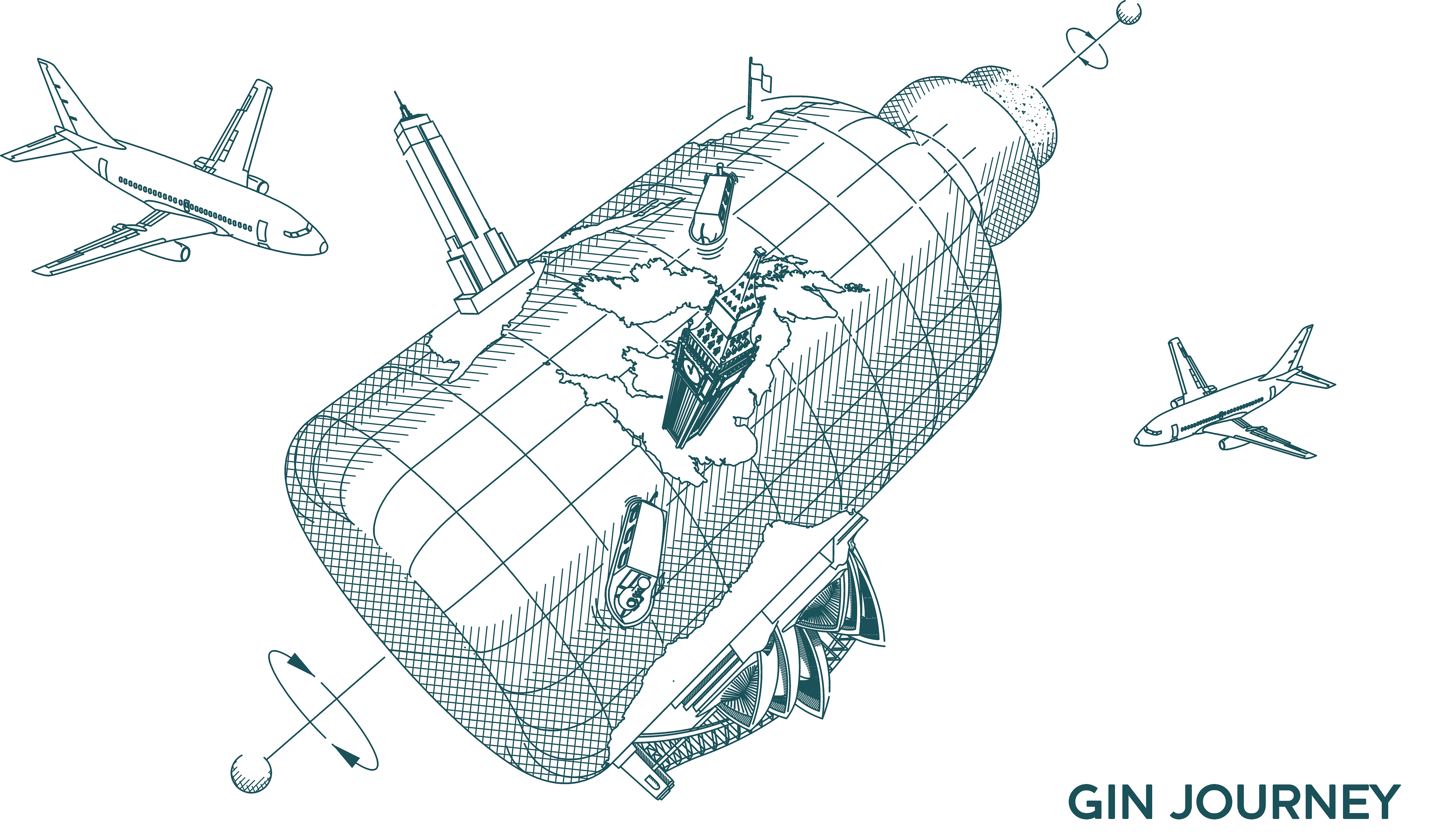
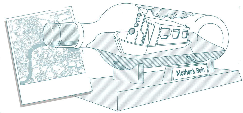
Gin Journey Identity


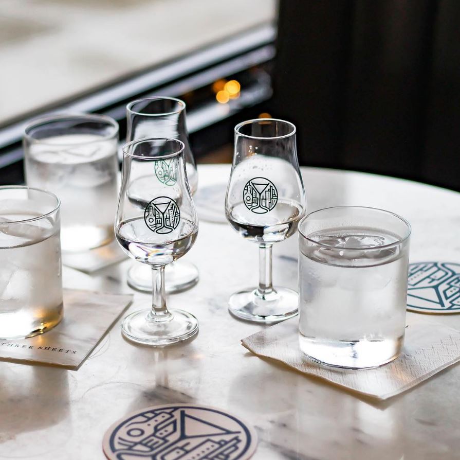
Growing from the original Shake Rattle & Stir concept the company emerged as the UK’s most successful nightlife experiences, eventually gaining No 1 position on trip advisor in London for over a year.
As part of this shift in business focus we helped simplify the branding to focus the identity on gin and gin alone.
The logo was created to illustrate the overall experience to the customer but also designed so that the shape would lend itself to items found along the way on the journey.
Gin Journey Illustrations
